Marker & Path Display Rules
Map View includes a powerful rule-based system for customizing how markers and paths appear on the map. These are called Display Rules.
How Display Rules Work
Each display rule consists of a query and a set of visual properties. When Map View decides how to display a marker or path:
- Start with the Default rule's properties (e.g. a blue marker with a circle icon).
- Evaluate each subsequent rule in order.
- For each rule whose query matches the marker/path, overwrite only the properties that rule defines.
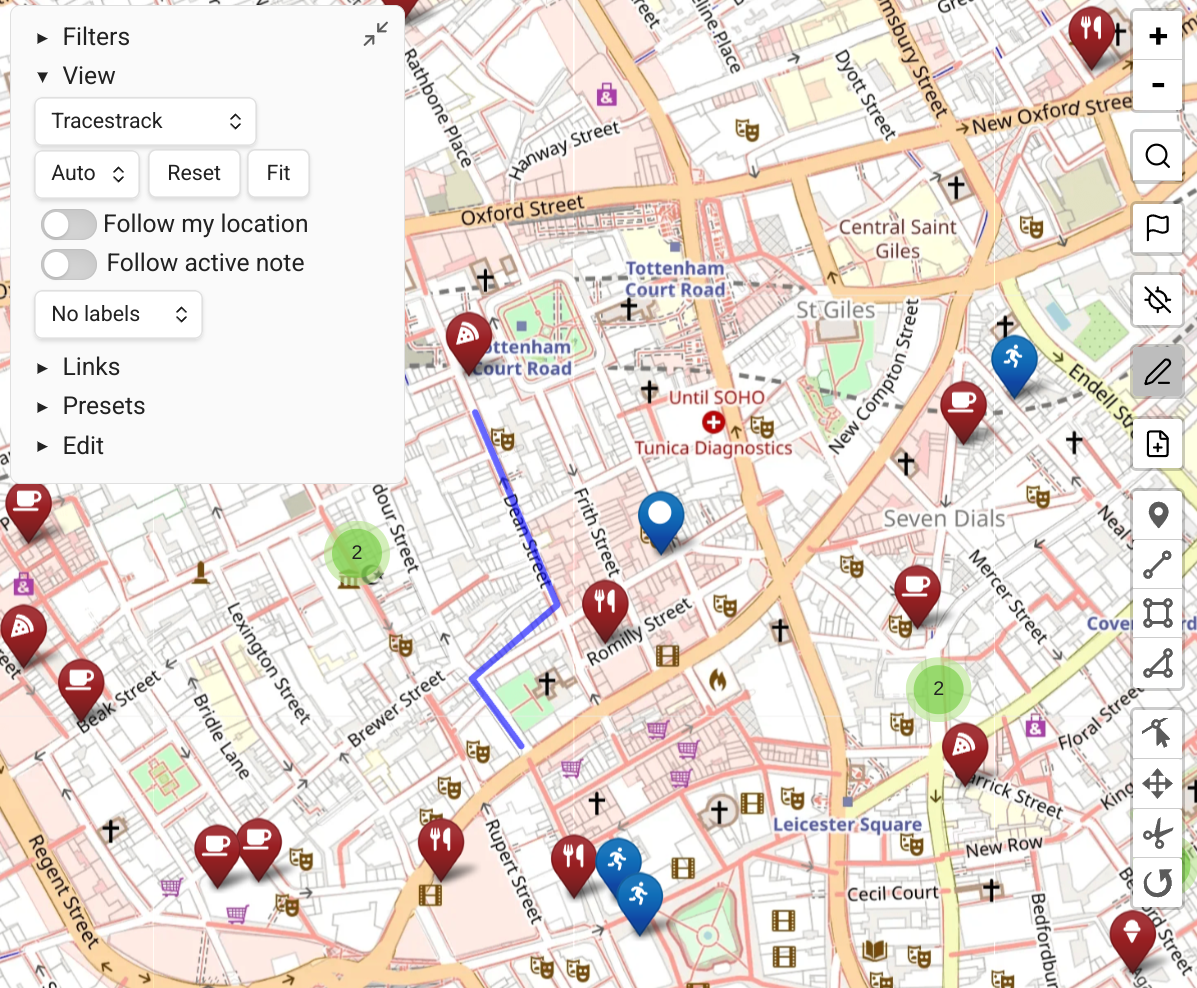
Example: The default rule sets a blue marker with an fa-circle icon. A rule tag:#food sets only the icon to fa-utensils. The resulting marker is blue (from default, not overridden) with a utensils icon (from the food rule).
Editing Display Rules
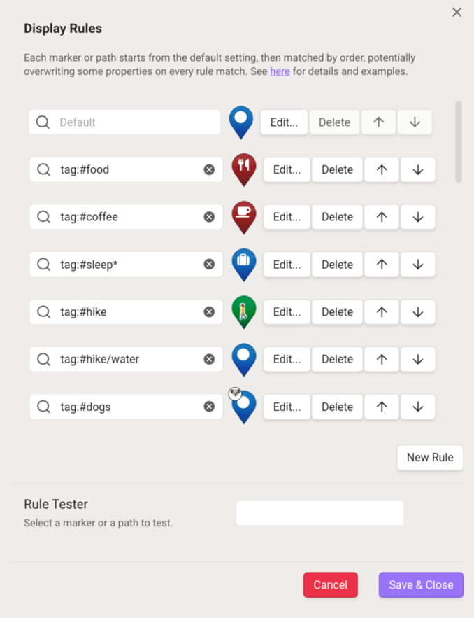
Open the plugin settings and click the button under "Marker & Path Display Rules".
You'll see the list of active rules. You can:
- Add new rules
- Change the order of rules (the Default rule is always first)
- Edit existing rules
When editing a rule, all properties are optional — only set the ones you want this rule to override.
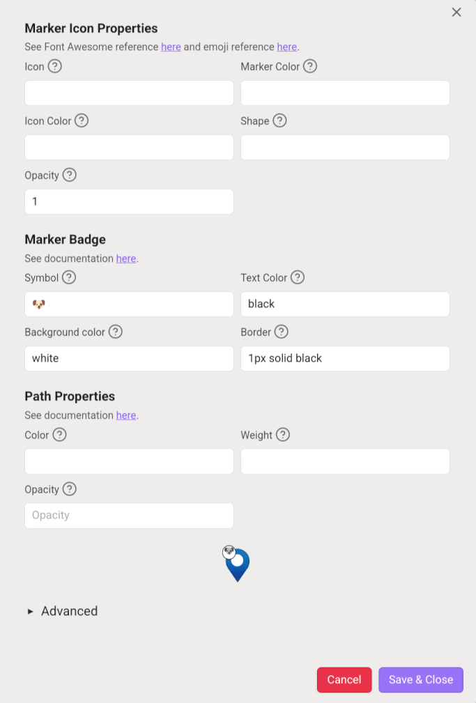
Marker Icon Properties
Icons are based on emojis or Font Awesome icons. Marker shapes, colors, and sizes are based on Leaflet.ExtraMarkers.
An additional simple-circle shape draws a circle at the given color without a pin.
Example: To give #travel-tagged markers a bus icon:
- Add a display rule with query
tag:#travel. - Click Edit, search Font Awesome for
fa-bus, enter it in the 'icon' box.
Or paste an emoji directly into the icon name box (e.g. from Emojipedia).
Additional marker properties:
opacity— controls marker transparency
Marker Badges
Badges are small circles added to marker corners based on matching display rules. Up to 4 badges per marker are supported.
Natural Use Case
If you have an icon for #food markers, add badges for vegan options, gluten-free, dog-friendly, etc. — each from a separate display rule.
Adding a Badge
In the display rule edit dialog, paste an emoji or up to 2 characters into the Symbol box.
Badge properties:
- Symbol — emoji or 1-2 character text
- Text color — color of the symbol
- Background color — badge background
- Border — CSS border string, e.g.
1px solid black
Matching badges appear starting from the top-left corner, clockwise.
Performance
Hundreds or thousands of badges rendered at once can be resource-intensive, especially on mobile. Consider increasing the "max cluster size in pixels" setting if performance degrades.
Path Properties
Paths work the same way: the default rule applies first, then matching rules overwrite properties.
Most useful path properties:
| Property | Description |
|---|---|
color | Line color (CSS color string) |
weight | Line width in pixels |
opacity | Line opacity (0.0–1.0) |
A full list of path properties (for advanced JSON editing) is in Leaflet's path documentation.
INFO
Stand-alone path files don't support tags -- only inline paths do. Use name or linkedfrom queries to style stand-alone path files.
Example: Have a central note "My Runs" that links to all your GPX files. Use the display rule query linkedfrom:"My Runs" to style these paths red.
Paths do not support badges.
Advanced: Editing Rules as JSON
The Edit Rule dialog has a "Edit as JSON" option that exposes additional properties:
- Extra marker icon options from Leaflet.ExtraMarkers
- Full path options from Leaflet path docs
- The
cssFiltersbadge property: accepts a CSSfilterstring, e.g.:jsonThis makes an emoji badge grayscale and slightly dimmer."cssFilters": "grayscale(100%) brightness(0.8)"